My experience working for Cashbac as UX Lead with major revamp for 2 Years
Cashbac is a platform created to reward everyone. Be it a consumer wanting to indulge more with less money or a business owner aiming to achieve business goals, our mission is the same: to help everyone in Indonesia earn the largest rewards possible through the simplest steps. Through our free mobile app and marketing platform, Cashbac gives instant cashback rewards for simply making a transaction.

We eliminate the need to top up rewards, the limits of expiry dates, and the hassles of trying to understand each other as consumers and merchants. Since our establishment, Cashbac has partnered with 1000+ merchants and dozens of banks to give instant cashback rewards to more than 100.000 users and we are still growing in our journey to simplify how users get the most rewards.
Overview
I have been working with Cashbac since 2019–2021 (now), which responsible for the holistic user experience, ensure a consistent and effective UX systemwide, while there’s so many interaction and interdependencies and so much necessary institutional knowledge of business and the user and the customer journey. Reviewing the product that going to be visible to the user. Cashbac had 4 platforms when the first time I joined the company, now it has 7 platforms.
I start by (1)building the product design team, (2)create a design system & define the persona, (3)make a research guideline & standard, (4)refine the design process with UX sprint, (5)change how the designer collaborates with the engineer in the development process, (6)how to measure success in design and (7)learn continues feedback from customer listening.
The Process
1. Building The Product Design Team
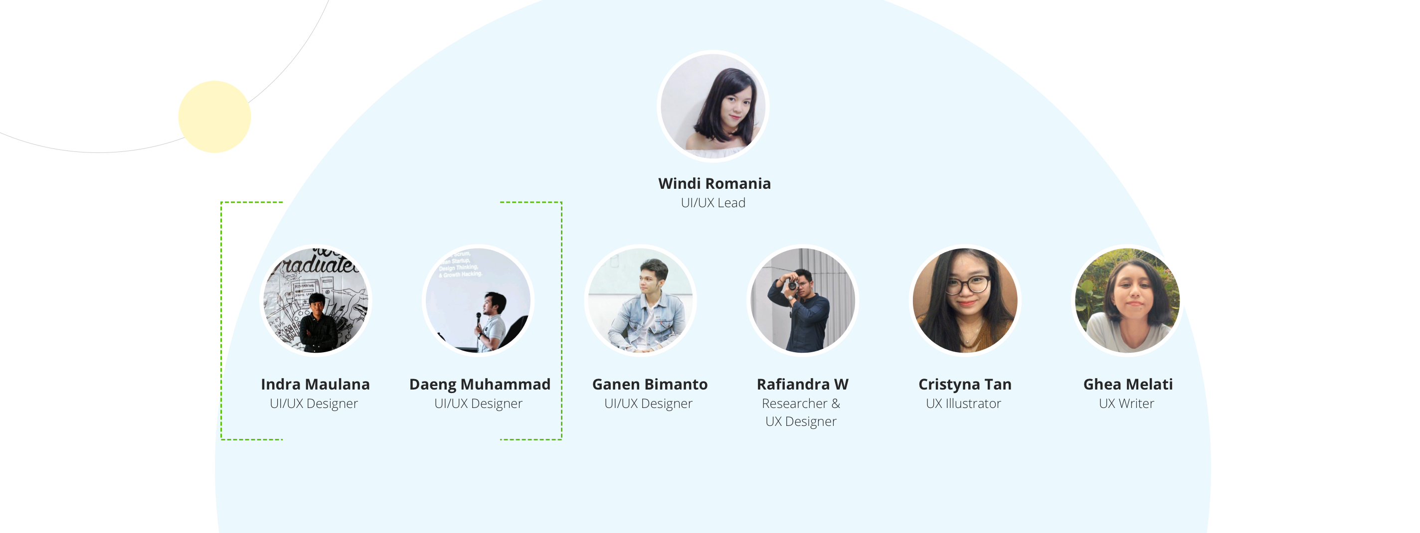
There are 2 UI/UX designers when I start my carrier as UX Lead at Cashbac. I need to understand the existing process and identify the problem. The first step to hiring the perfect user experience teams starts with understanding why you want to hire these people in the first place. I hired 4 people more to the team which is UI/UX designer, UX researcher, UX Writer, and UX Illustrator. I’m so happy about their passion for product design things.
There is a quote from John Doerr, the famous Silicon Valley venture capitalist: “We need teams of missionaries, not teams of mercenaries.”
For me, their attitude and passion are the most important things. “Hire for Attitude, Train for Skill”-Harvard. The key is to tell them what to do, not how to do it. Give them a clear objective & believe them. They are empowered to figure out the best way to meet those objectives, and they are accountable for the results.
Let them learn something new with 70-30% portions. 70% for their main role, and 30% for something new. For example, if he was a UI Designer, 70%: UI/UX design and 30% research.

As you navigate through the rest of your life, open to collaboration. Other people and other people’s ideas are often better than your own. Find a group of people who challenge and inspire you. spend a lot of time with them, and it will change your life. — Amy Poehler
2. Create A Design System & Define The Persona
There are two basic approaches to creating a design system, in this case, I was combining a big bang (created in a relatively short amount of time) & a slow drip (adds an element to the design system each time they create or change one for the project) approach.
Start from 5 pages that are already redesigned collect the element, text style, icon, & button, etc. It should be considered a living document, we have to continually improve and maintain the design system. Once you’ve done with this your UX team will work faster & effectively.
Make sure it accessible & actionable by connecting google drive sync with your sketch library so everyone is aware of it every time there’s an update.

While persona is defined by reading our customer data to find the biggest group and start to create models called persona to represent the users of Cashbac’s. We interviewed some of them to know their pain points and needs for current design and give potential solutions. Update it every 6 months to aim right target audience and give a better UX solution.

3. Make A Research Guideline & Standard
I have changed our research participants from Cashbac’s Employee to real user. The challenge is how to recruit participants without any budget from the company. We start it by following Cashbac’s event and ask the transacted user directly there or call user from the phone and meet them at Starbuck around their area.
Research is what informs so many of the decisions that must be made every day. Without this deep customer knowledge, you’re just guessing. This requires both qualitative learning (to understand why our users and customers behave the way they do), and quantitative learning (to understand what they are doing).
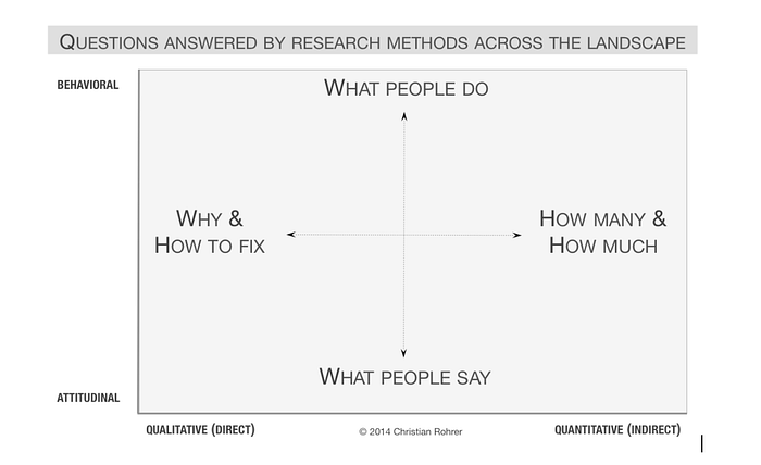
We have to analyze and choose the method wisely. These are 3 easy steps that we do in Cashbac to choose the most common UX research methods.


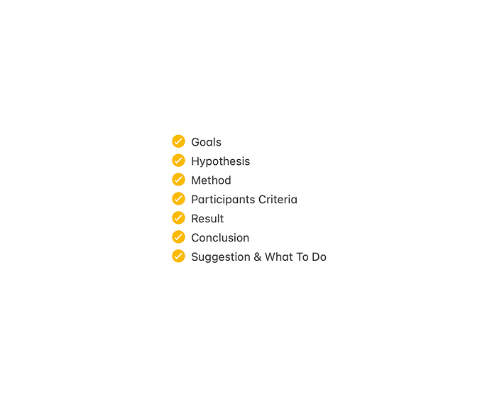
The most important thing is a research report, a well-crafted document that outlines the processes, data, and findings of a systematic investigation. It is an important document that serves as a first-hand account of the research process, and it is typically considered an objective and accurate source of information. Here is the report structure that we usually used in Cashbac :
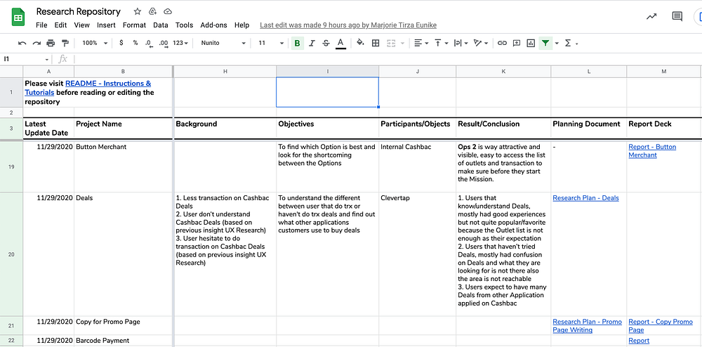
Now our UX team already has a monthly budget for research, I am so happy about this. We keep doing research for a small or a big product improvement to know: customer issues, pains, desires, how they think—and for business products, how they work, and how they decide to buy.
4. Refine The Design Process with UX Sprint
As an organization, we’ve been growing over the past several years from a time when we could just walk over to someone’s office and make an informal design request to a time where that kind of process is impractical and unmanageable. Well a manager, should manage it. That’s why I refined the design process with UX Sprint, by adopting engineer sprint and adjust it our way.
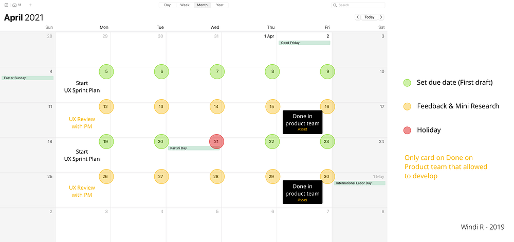
We have 2 weeks for every sprint, start with UX Sprint Plan on Monday, in here every product manager will bring the user story with some details, I will dig it deeper with some questions about the scoop, objective, a reason to create that features, what they want to say (for UX writer) & old flow, the team also can ask questions during this session. When the direction clear the team will choose a due date (green circle) for that user story, start from the UX writer and continue by UI/UX designer & mini-research. Every designer can take 1–3 user stories/sprint.
Continue with second Monday with UX review with PM, every PM will give their feedback about each user story while I & head of product can add our feedback as well, after that the designer can refine the design and prove their assumption with mini-research.

While the research part (big research) will take the whole sprint by pairing the UX researcher with the UI/UX designer in the previous sprint.
At the end of the sprint, a designer will make sure all assets ready to download through Zeplin, and the writer prepares a wording document & another language in sheet for development.
5. Change How The Designer Collaborates with The Engineer in The Development Process
The problem is we have a lot of design debt, our existing raw file doesn’t match with our live-in production app/web. Sometimes PM cut some features after discussing with the engineer and didn’t update the product designer about that. The reason could be varied, but mostly because we simply can’t afford the time and cost to deliver it. (feasibility)
Marc Andreessen, “The most important thing is to know what you can’t know,”
Since we don’t know that Then, I decide to include each designer in Dev Sprint to avoid design debt.
1. When Dev Sprint Start – Update the final design to Zeplin, prepare asset & another language
2. Grooming 1 – Ask the PM to show the latest wireframe that we are working on to get early feedback (Possibility to develop with certain time)
3. Grooming 2 – Hi-fidelity feedback will be more fun and talkative (cut or add some flow)
4. Sprint Review & Retrospective – Learn what to improve & make a great collaboration

We have a 1,5 sprint gap between UX and Dev. So when designers in the second week of the UX sprint (medium workload), they can help Engineers to explain the interaction, missing assets, or any minor problem along the way.
6. How to Measure Success in Design
We don’t know what they are doing, how they’re interacting with our app when no one beside them. It was untrackable until we finished all revamp and ask the Engineer to put the tracker flow by flow. I wait for it for 1 year until everything is trackable.
Design is not just what it looks like and feels like. Design is how it works. – Steve Jobs
Learn, monitor, and improve how it works with quantitative learning, We are also doing A/B testing with the real users before developing it into permanent features.
While for me UX Team has to give an impact on the business, like increasing MAU or Transaction. We have to measure success in design & solve the problem.
7. Learn Continues Feedback from Customer Listening.
Last, I involving designers in the Customer Service weekly update. We have to learn the real problem outside there, what our users complaining about.
We also need to understand feedback from Data analysts for better design thinking.
The Result
We don’t do it all at once, we did it flow by flow, sprint by sprint. Yes, it’s better, since users hate changes because it takes time to learn new designs and annoying when they use it in hurry.
Keep improving the user experience step by step, give an introduction, don’t forget to track it well to aim for the next goal.
Remember these 4 words: Value, Usability, feasibility, Viable. – For creating a great product
At Cashbac we have some platforms: user app, merchant dashboard, internal dashboard, cashier app. We also have cashbac.com, pay later, white-label recently.
But this time I will share our work for the user app only, this is how Cashbac app looks like before I join the team:
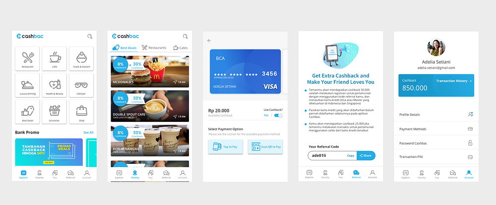
Here we go with a new revamp & some success stories:
1. Dynamic Home Page Content
A dynamic homepage can evoke positive emotions in visitors, increasing the chances of their interaction, (1)We can target promo base on user location, (2)nearest outlet base on category, (3)collection base ongoing promo, (4)popular place base on the mall, (5)new merchants, (6)visit& order again collection for user engagement.
The best part is we can change it every time without any development needed, in this case, we can change from 19.712 to 35.080 monthly active users. (before covid-19)

2. Awesome Search Suggestion Feature
Well, Cashbac is basically an app that focuses on rewarding and merchant, not a payment focusing app. How to ensure users that we are a rewarding app? this is another answer to my previous Cashbac’s challenge
The problem is users just know the promo at the offline outlet and pay from our app. The goal is to give that information online. We are increasing the outlet detail page with this search suggestion feature. Not only become the biggest channel to outlet detail page but also have great funnel conversion that leading to user transaction success.

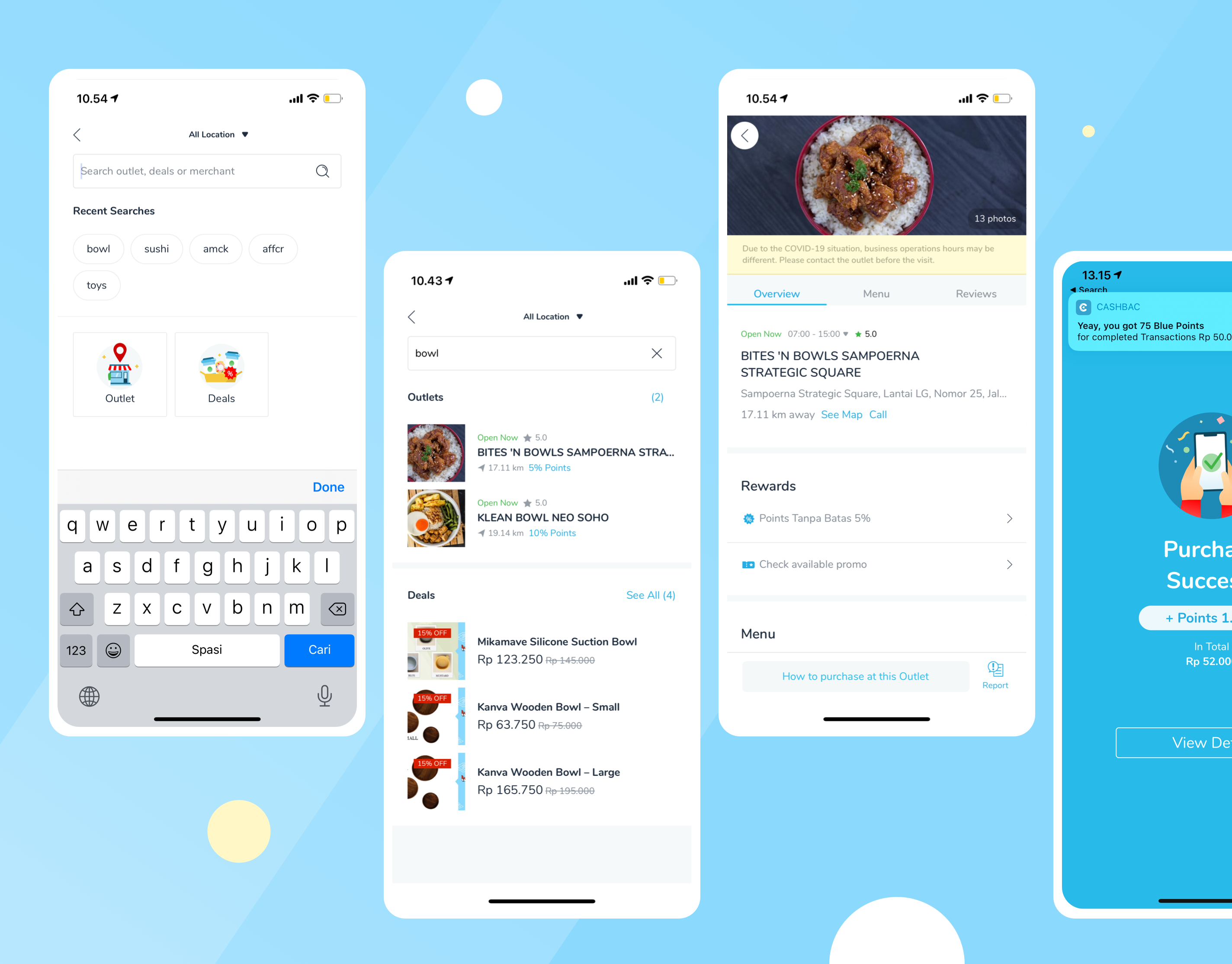

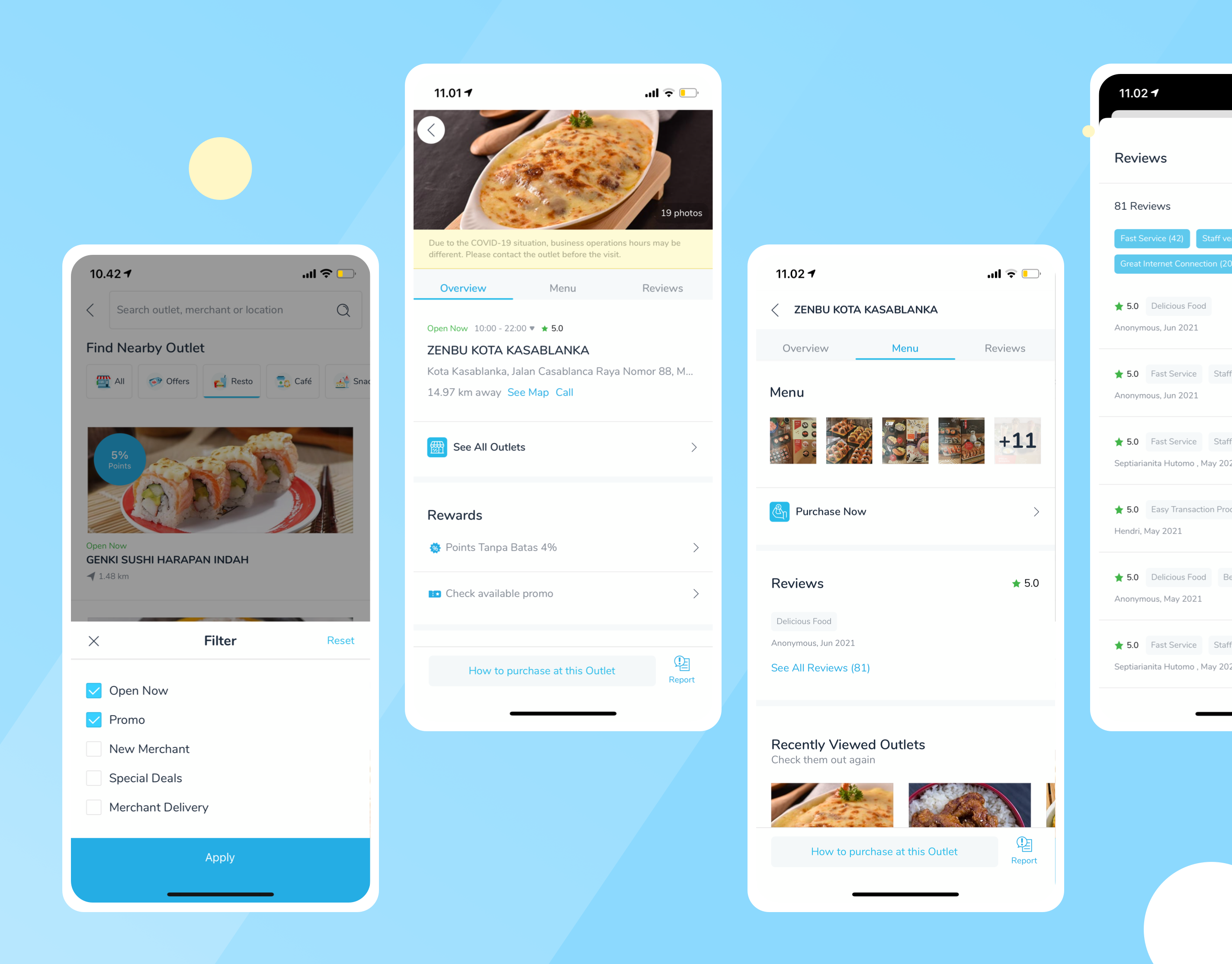
3. Outlet Detail & Promo Detail Page — Success Story
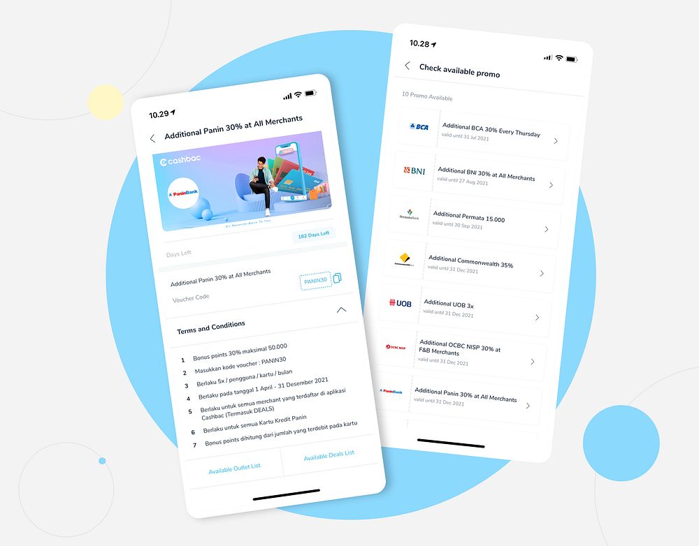
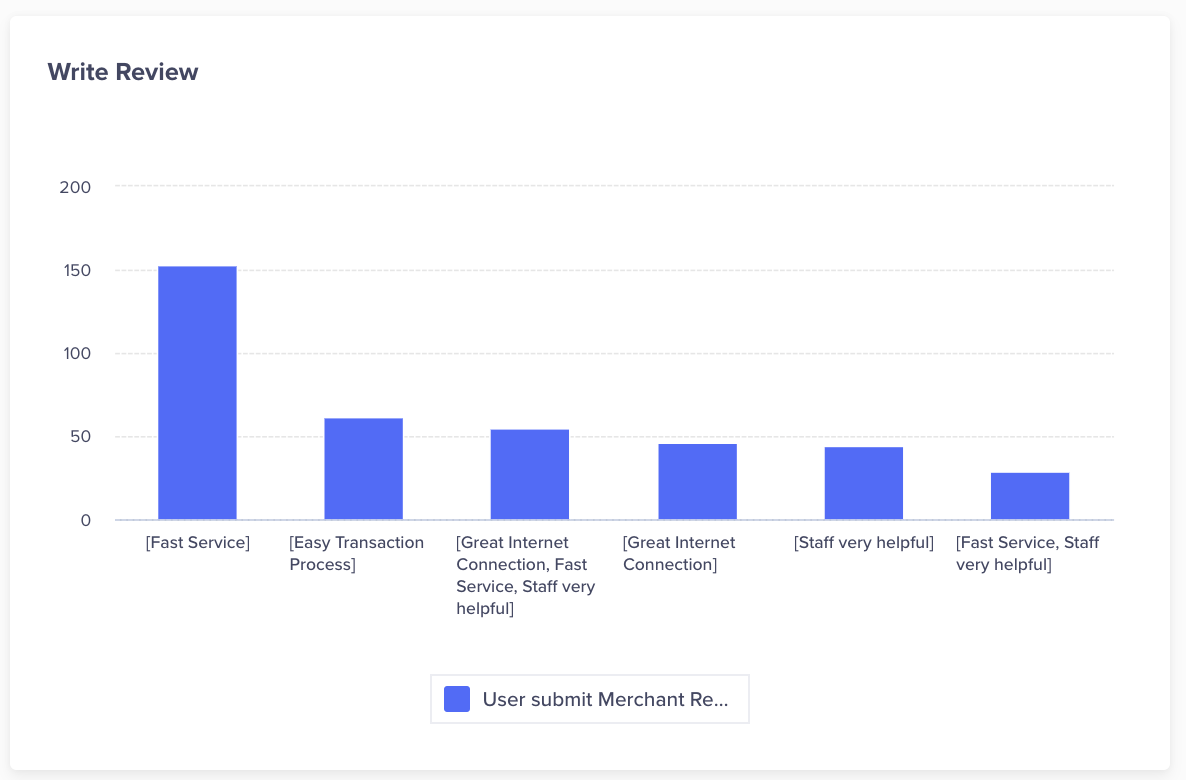
We have changed the outlet detail page according to design principles and added a review feature to enrich the information about the outlet, but the most important thing is we have added the promo list page and promo detail page that align with our business goals and get 28.8% of our users view this page every day.
4. Linked Card, Pay at Outlet & Pay in App
Only by changing the main icon, we have increased the user conversions for successful transactions from 66% to 80%, we have also redesigned the payment page for more convenient transactions.
We have also developed a pay-in app from the ‘cashier app’ or from other websites/apps.


5. New Account Page with Tier Based Program & Mission
Automate upgrade/downgrade scenarios for tier-based program. Customized benefits for each level & mission for user engagement.


Credit: My lovely UX team, insightful PM & my inspiring Boss. So happy to work with you guys!
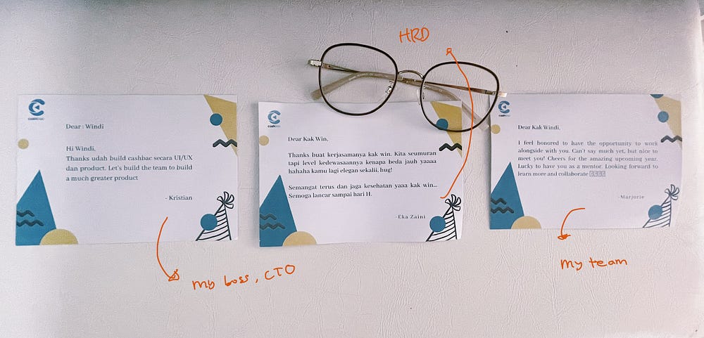
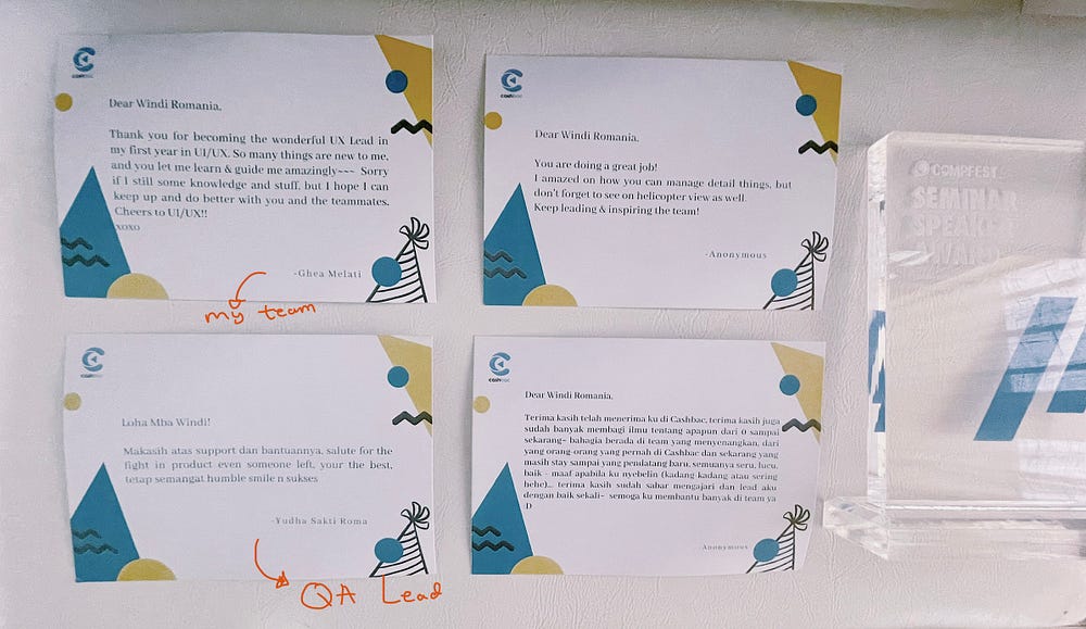
Another sweet experience in Cashbac: Every employee writes a letter for the most inspiring people at Cashbac on Cashbac’s 3rd birthday, I write it for my boss, Kristian. Surprisingly I got 7 letters from my colleagues & my boss as well :
And that’s a wrap! If you liked this experience, please give it a clap :)
